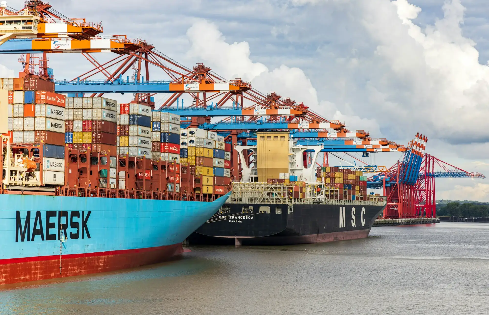
A local forwarder, ready for a global stage.
Logo and brand identity for a Durban logistics company expanding internationally, starting with the United States.
What we did
The challenge
A brand that works in its home market has to work harder abroad. SOZO needed an identity that new customers and partners in the United States would read as credible from the first document they saw, while staying true to the team and relationships that built the business in South Africa.
The idea
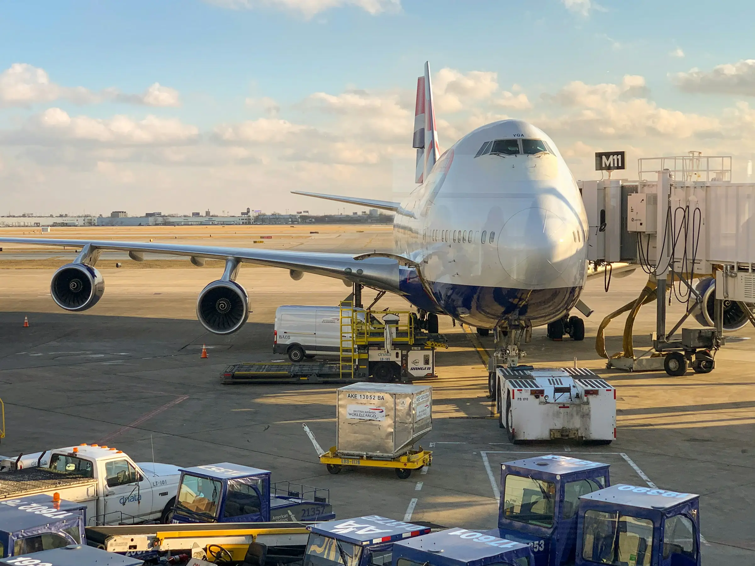
One mark for every route
The
approach
A mark built to travel
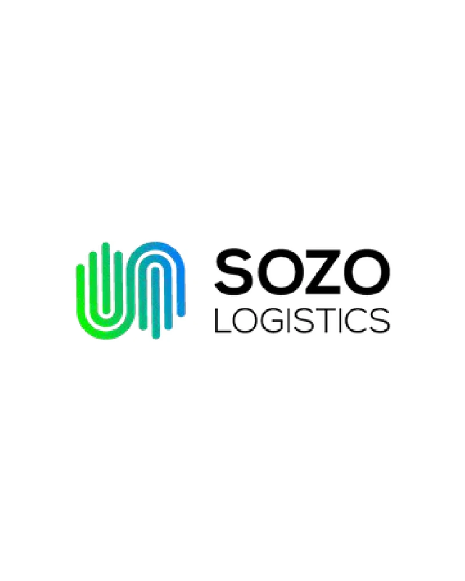
The logo had to hold up at every size and in every market. We designed a simple, distinctive symbol paired with a clear SOZO Logistics wordmark.
An identity for expansion
Colour, typography and usage rules give the team one consistent way to present SOZO as it enters new markets, starting with the United States.
Designed for real touchpoints
We built the identity for the places a logistics brand is actually seen: proposals, partner documents, the website and everyday operations.

Outcome
SOZO still uses the identity today, across its website and its operations in South Africa and the United States. A mark built to travel, still travelling.
Visit SOZO Logistics